Dieter Rams is one of the most influential consumer product designers of all time. His work at the German firm of Braun was legendary and created the design language that we now take for granted. His style is minimalist, and he described his philosophy of design as “less, but better.”
He had ten principles of good design which, fifty years on, still offer essential insights about creating products that are timelessly elegant. Here’s a look at five of those principles, how to apply them, and why some products just don’t get it right.
1. Good Design is Innovative
Technical advancements will always create new opportunities for innovative design. Below are two examples of Braun radios of different eras:
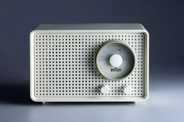
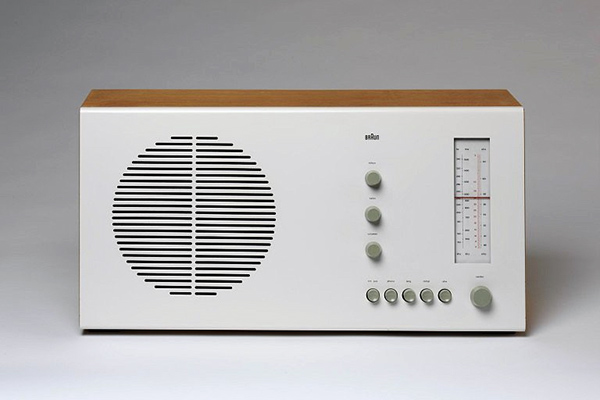
Technologies change and so too did the look of these two radios. Over the years, a perforated plastic screen was replaced with a brushed aluminum grill. Plastic knobs were updated with metal push buttons, while the circular dial evolved into a linear, calibrated scale.
But despite the differences in technologies inside the cabinets, both units are still well-proportioned. The control buttons are uniform in size while remaining small and discrete. The facade is a clean surface without excessive ornamentation. No stylistic element overwhelms any other, and all are necessary to functionality.
Compare to this:
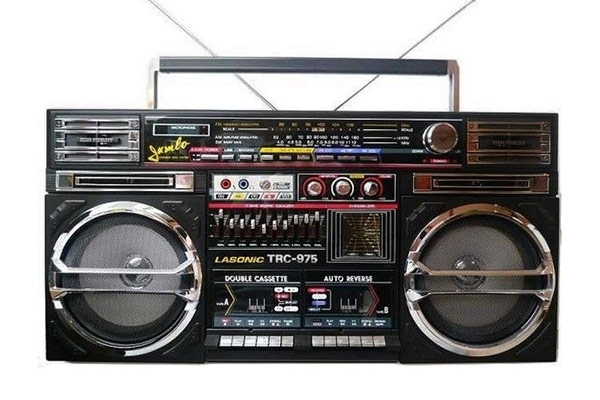
Innovation may be one thing, but complications for their own sake must be eliminated. Here there are way too many buttons, displays, panels, fascias, bezels, sliders, etc. Obviously this design was intended to be hyper-technical and industrial as part of its style. Dieter Rams famously hated design as a fashion statement and felt it would immediately “date” the work, as in this case.
2. Good Design is Aesthetic
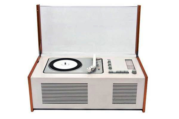
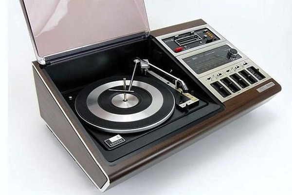
Both turntables play vinyl records but let’s face it, looks matter. The turntable on the right just looks poorly thought out. It has a faux wood cabinet, a sloping front fascia that confuses the design and control switches of several different types. It seems like it would clash with any home decor.
3. Good Design Makes a Product Useful
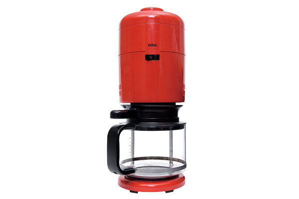
“Good design emphasizes the usefulness of a product whilst disregarding anything that could possibly detract from it.” The Braun unit on the left is perfecty sensible. Hot water at the top flows straight down to the brewing unit, then straight down to the pot, all in line with the base. Cohesive, unified, elegant and logical. This product was from 1972 and still looks modern.
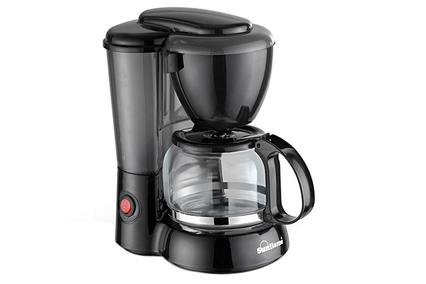
The coffee maker on the right, while still making coffee, has multiple convex surfaces that do nothing to enhance its functionality. The water reservoir is behind the carafe, so water must be pumped up, sent over to the brewing unit, and then down to make coffee. Inefficient, and it consumes a larger footprint on the countertop.
4. Good Design is Unobtrusive
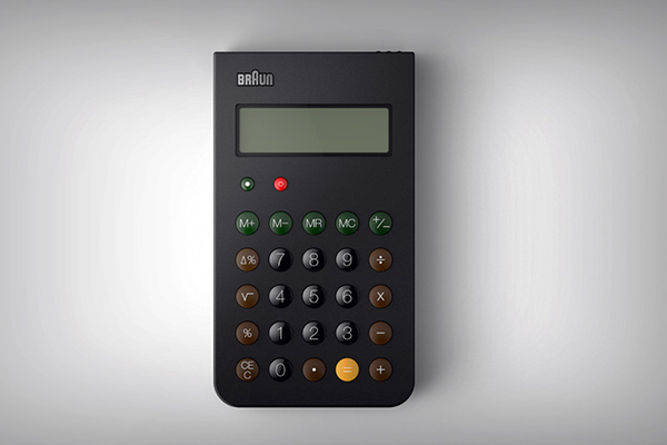

This calculator does not draw attention to itself but its purpose is intuitive and self-evident. Functional buttons are divided into color-coded groups, with everything you need but nothing you don’t. The buttons are small and nicely rounded, which sets them apart and makes them easier to find with the tips of one’s fingers. And, notice the simple matte black case, suggesting quality and durability without screaming “Look at me!”
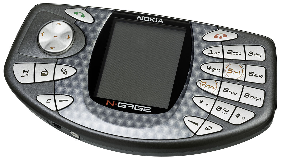
An infamous design fail, the Nokia N-Gage tried to be a phone and video game player in one. The user interface was a stylistic disaster, with buttons of all different sizes, shapes and angles. And because of this layout it’s easy for the fingers to accidently press one key rather than another.
The patterned plastic around the display also appears cheap, pretending to be machine-turned aluminum and fooling no one. This violates another maxim: Good design is honest.
5. Good Design is Thorough Down to the Last Detail
This is especially important when designing for manufacturing. “Nothing must be arbitrary or left to chance. Care and accuracy in the design process show respect towards the user.”
Compare these two 8mm film cameras, both of which were made in 1968:
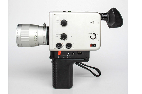
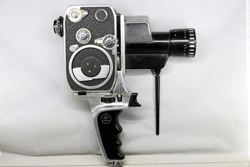
The Bolex camera, on the right, appears to be made from leftover pieces of other machines, slapped together without a single unifying element. Not only does it appear ungainly, but suggests how awkard it would feel in the hand and how difficult to operate. Contrast that with the Braun unit on the left. All of the materials appear durable and high quality. The lettering is clean and precise and perfectly contrasted against the silver background. It looks like a scientific instrument and appears perfectly balanced for the hand.
Apply These Tips on Your Next Project
These examples show just a small part of the wisdom of Dieter Rams and his design school. At all times he emphasized clean lines, balanced proportions, high-quality materials and construction, and a respect for the function of the part. Not incidentally, attention to detail during the design phase also helps to eliminate problems when it comes to manufacturing.
You can find more design tips in our resources sections, and we’re standing by to help you when you upload your CAD files for a free quotation.


