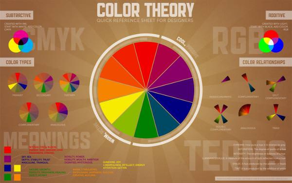
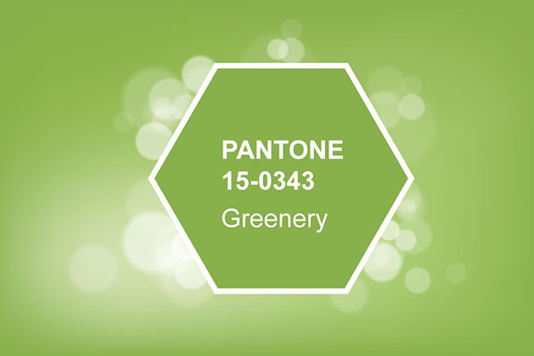
How many colors are there? Most people can see more than ten million distinct colors, hues, shades and tints. That’s a large palette to choose from. In order to get the most benefit from using color in product design, we’ll first explain color theory and terminology. Then we’ll explore ways to use this knowledge for improving your products with colors that work together to add interest, impact and emotion. There are many ways of describing color, organizing it and mixing it for use. For this article, we will use the 2017 Pantone® Color of the Year, Greenery, as a reference.
Color Theory and Terminology
What Is Color?
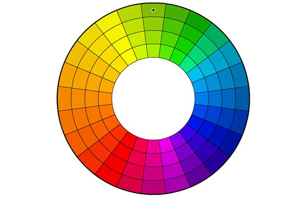
Color is the visual perception of a wavelength of energy in the electromagnetic spectrum. There are three main cone receptors in the human eye, and they naturally respond best to the base frequencies of red, green and blue. Other colors are variations away from these main frequencies.
What is a color space?
A color space is a way to arrange colors in an organized and coherent fashion. There are several ways to do this, depending on application and viewing conditions. For example, the RGB color space, corresponding to red, green and blue, is primarily used in transmissive color, i.e, computer screens and televisions, where colored light is being transmitted directly to the eye. This is also called additive color.
Color can also be thought of as subtractive, such as in print on paper, where pigments and inks are used to absorb certain wavelengths. Therefore what we see is what’s left over, after the other colors in full spectrum light have been subtracted. For subtractive color spaces, the primary colors are cyan (C), magenta (M), yellow (Y) and black (K), representing the CMYK color system.
What is a tint?
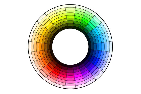
A tint is a color that has been made lighter with the addition of white.
What is a shade?
A shade is a color that has been made darker with the addition of black.
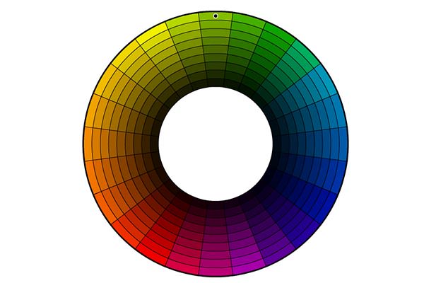
What is a tone?
A tone is a color that has been changed with the addition of neutral gray. Sometimes such colors are said to be less saturated, or more subdued and less intense.
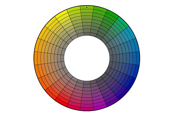
What is a hue?
A hue is a perceptible degree of variation away from a known color. Since green is one of the primary colors, our reference color of Pantone® Greenery is considered a hue of green and yellow.
Improving your products with colors
Now that we have a basic understanding of color terminology and how color space is organized, you’ll want to know how to mix and match different colors to create moods, inspire emotion or energy, or to be most pleasing to the eye. As it happens, color spaces are useful for generating color harmonies, which are great ways to understand how to organize colors for effective designs.
What are color harmonies?
Color harmonies are groups of colors that go together well based on their relationship within a color space, much like certain musical notes naturally fit well together to make chords that we find pleasing. Color harmonies are not physical absolutes but are useful to the designer for establishing patterns and creating color palettes.
These are some examples of color harmonies.
Complementary colors
Complementary colors are those which are directly opposite on the color wheel.
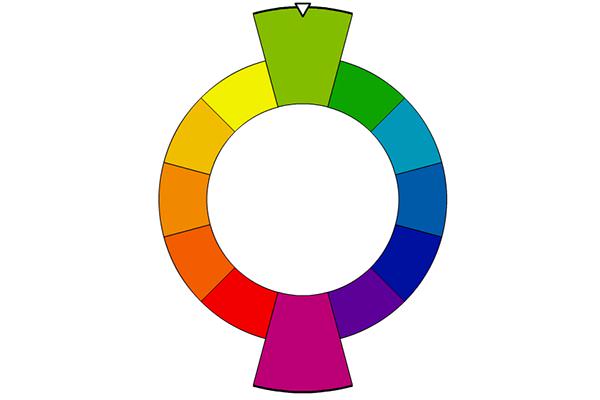
In our example, the complement to greenery is a hue of purple. Complementary colors have the highest contrast, and the most visual tension. (This is, incidentally, the reason why the green-skinned Hulk is always wearing purple pants in the comic books. Now you know.)
Split complementary
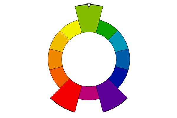
Similar to a complementary harmony, the split has one primary (our greenery) and two opposing colors that aren’t quite complementary. These two help to maintain the contrast but divide the tension to soften the effect a little bit.
Triadic
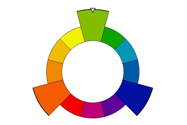
Triadic colors are evenly spaced at three points around the color space. This creates a greater diversity of color choices for the designer that can be very striking, but it requires careful balancing. In this case, as with many others, it is usually best for you to choose one color that’s dominant and the others to be supportive or used as accents.
Square
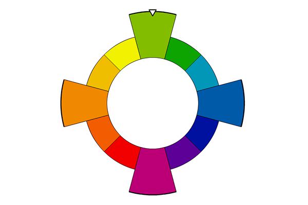
Touching on all four points of the color wheel with even spacing, a square color harmony also benefits from using one color as the dominant. Also, this pattern should balance warm colors (red, yellow and orange) with cool (green, blue and purple). Notice that these colors are pairs of complements.
Rectangle
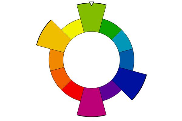
Similar to the square pattern, the rectangle also has four cardinal points evenly divided between warm and cool colors, with opposing complements. Notice that the pairs of colors are more closely related to one another but still provide interesting contrast.
Analogous
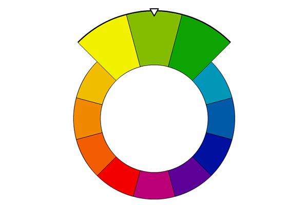
Analogous colors are those that are closely spaced together on the wheel. There is no exact definition for how close you want them to be, which is up to you. This harmony is especially useful when a product’s identity is closely tied to one color family or to a color temperature. For example, outdoor recreational products may rely on different hues of green to be associated with nature, sunlight and energy.
Everyone has their own opinion about which colors, and color combinations, they like best. The examples above show just some possibilities for creating emotion, balancing color temperatures, and using complementary colors for accents and contrast. Making use of this information can help inspire your design creativity as well.
We have a lot more information, including how colors are mixed for plastic injection molding, how we verify color in our quality control and inspection department, and how we apply colored finishes in our state-of-the-art painting room.
Want to know more? Contact us today for a free quotation and project review and we can help you find the right look for your next great product.
*Additional information provided by tigercolor.com and their Color Impact 4 software.
Tagged:

